[BRANDING]
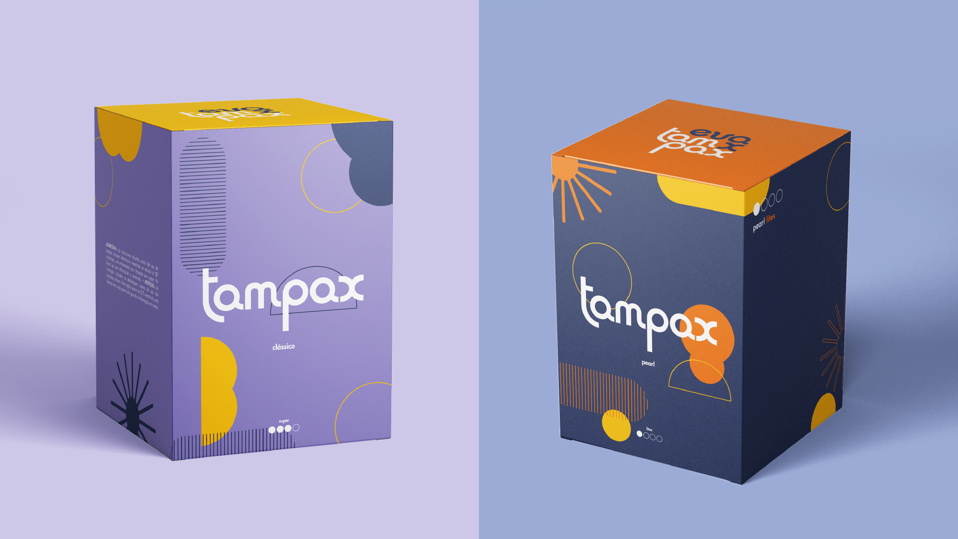
The rebranding of Evax & Tampax aims to create a new visual identity whose main goal is to normalize menstruation-related dialogues in an inclusive and comprehensive way to all genders and non-genders.
This project came to life out of a feeling of boredom and tiredness of constantly seeing the same so-called feminine colours and shapes on the supermarket shelves in the menstruation aisle. As an attempt to include every person who menstruates (gendered, non-gendered & agendered), we decided to create a colourful and vibrant packaging to not only fight the stereotypical palette but also to make pads and tampons visible and seen as empowering tools instead of ‘embarrassing’ ones, which also lead us to create iconography and infographics to educate about its use, making menstruation an accessible taboo.
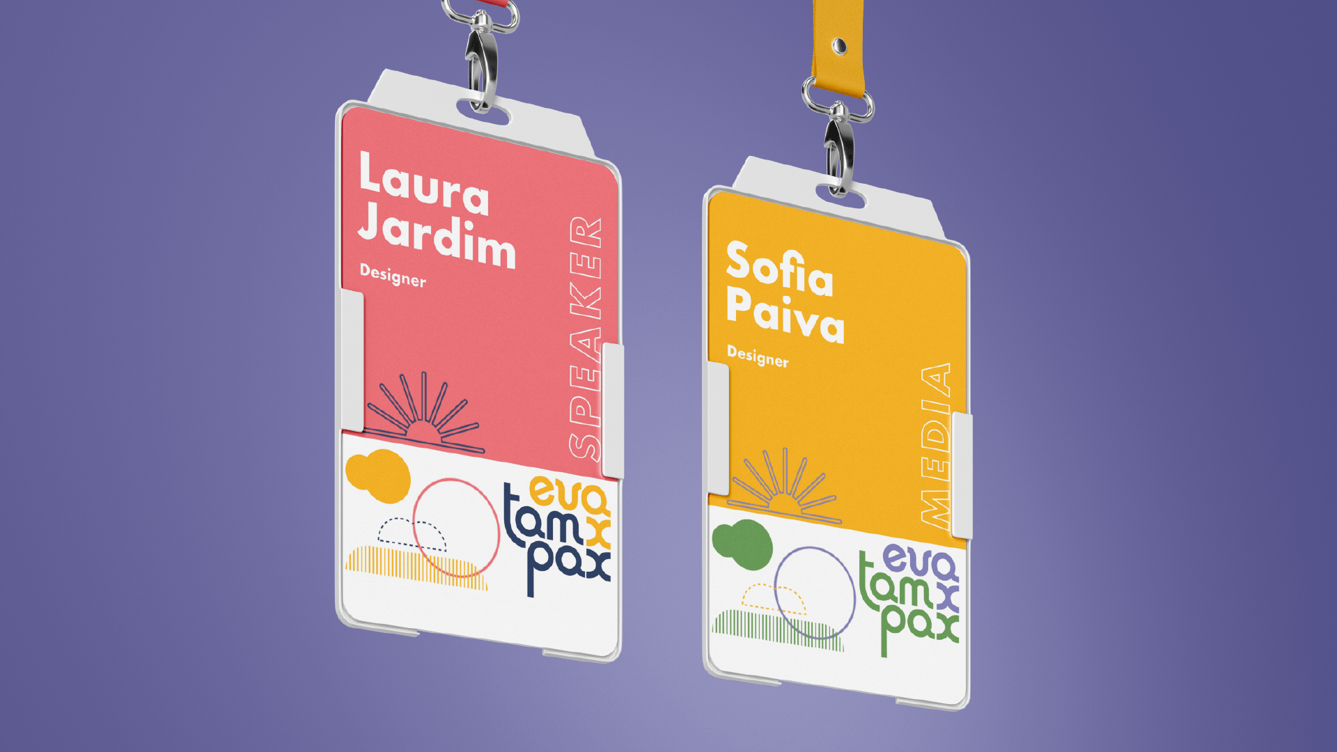
Collaboration with Laura Jardim, Mariana Godinho, Telma Maia & Carolina Barbosa
This project came to life out of a feeling of boredom and tiredness of constantly seeing the same so-called feminine colours and shapes on the supermarket shelves in the menstruation aisle. As an attempt to include every person who menstruates (gendered, non-gendered & agendered), we decided to create a colourful and vibrant packaging to not only fight the stereotypical palette but also to make pads and tampons visible and seen as empowering tools instead of ‘embarrassing’ ones, which also lead us to create iconography and infographics to educate about its use, making menstruation an accessible taboo.
Collaboration with Laura Jardim, Mariana Godinho, Telma Maia & Carolina Barbosa